

Persona
To gain a better understanding of the target audience and align design decisions accordingly, we have developed a persona for users. This approach will help us find solutions that cater to the needs of both youths and visitors

Overview
Overview
Tzu Chi Humanistic Youth Centre aims to instill humanistic values in the younger generations. The Foundation also hopes that the HYC can serve as an international arena for global youth related events which will help to connect Singaporean youths with young people from around the world. Even though having a Buddhist origins, they aim to be secular and are open to every race and religion.
Tzu Chi Humanistic Youth Centre aims to instill humanistic values in the younger generations. The Foundation also hopes that the HYC can serve as an international arena for global youth related events which will help to connect Singaporean youths with young people from around the world. Even though having a Buddhist origins, they aim to be secular and are open to every race and religion.
Problem
Problem
Our client informed us that their website is underuse and often have users resort to phone calls to find information that are available on their website. They also want to have a secular image so as to not deter youths from varying backgrounds to use their facilities and attend their events.
Our client informed us that their website is underuse and often have users resort to phone calls to find information that are available on their website. They also want to have a secular image so as to not deter youths from varying backgrounds to use their facilities and attend their events.
Solution
Solution
To redesign their website to have a more inclusive and secular design with an appealing and simple look to encourage more users to interact with their website.
To redesign their website to have a more inclusive and secular design with an appealing and simple look to encourage more users to interact with their website.
User Interviews
To fnd out the underlying factor of the website being underuse, we interview users who are at the physical location. What we found out was that after signing in for the WiFi, users are brought to the website but they did not use it afterwards. Here are some insights that we gathered
Users found the website to be lacking of information on facilities such as opening hours of cafe and bookings of space as well as upcoming events.
Users feel that the website lack a youthful image as their colors and pages looks stale and boring. They are also filled with mostly text and lack vibrant images
Book A Space Page
Old Design
Tzu Chi HYC has areas around its centre where users can book. Students can book a small space to study or an organization can book a function room for an event. Currently each space does not have sufficient information and users wil have to select “view detail” which will open a pdf that show more details.

New Design
By having important details such as size and price, users can have a smoother process for booking. Also by adding a “Book Now” button, this process is further expedited.
Volunteering Page
Old Design
The old design had very little colour and their content feels unengaging and dull. Their images are cramped into a circular shape which makes it hard for users to see the context of it.

New Design
We added more vibrant colours and increase images size to add a sense of youthfulness. By shortening text and changing it into a more engaging and easier readability, we ease of the overall visual load of users.

Home Page
Old Design
The home page currently lacks information and is very empty. There also isn’t a flow or direction which makes it harder for users to understand when first entering this website.

New Design
Having small sections of important parts of the website be on the homepage, users can locate what they are looking for immediately and will not have to find it manually on the website. We also added more images and a carousel hero section to help users overall visual load.

User Interviews
To fnd out the underlying factor of the website being underuse, we interview users who are at the physical location. What we found out was that after signing in for the WiFi, users are brought to the website but they did not use it afterwards. Here are some insights that we gathered
Users found the website to be lacking of information on facilities such as opening hours of cafe and bookings of space as well as upcoming events.
Users feel that the website lack a youthful image as their colors and pages looks stale and boring. They are also filled with mostly text and lack vibrant images
Persona
To gain a better understanding of the target audience and align design decisions accordingly, we have developed a persona for users. This approach will help us find solutions that cater to the needs of both youths and visitors
Page Redesigns
Page Redesigns
Home Page
Home Page
Old Design
The home page currently lacks information and is very empty. There also isn’t a flow or direction which makes it harder for users to understand when first entering this website.
Old Design
The home page currently lacks information and is very empty. There also isn’t a flow or direction which makes it harder for users to understand when first entering this website.
New Design
Having small sections of important parts of the website be on the homepage, users can locate what they are looking for immediately and will not have to find it manually on the website. We also added more images and a carousel hero section to help users overall visual load.
New Design
Having small sections of important parts of the website be on the homepage, users can locate what they are looking for immediately and will not have to find it manually on the website. We also added more images and a carousel hero section to help users overall visual load.
Volunteering Page
Volunteering Page
Old Design
The old design had very little colour and their content feels unengaging and dull. Their images are cramped into a circular shape which makes it hard for users to see the context of it.
Old Design
The old design had very little colour and their content feels unengaging and dull. Their images are cramped into a circular shape which makes it hard for users to see the context of it.
New Design
We added more vibrant colours and increase images size to add a sense of youthfulness. By shortening text and changing it into a more engaging and easier readability, we ease of the overall visual load of users.
New Design
We added more vibrant colours and increase images size to add a sense of youthfulness. By shortening text and changing it into a more engaging and easier readability, we ease of the overall visual load of users.
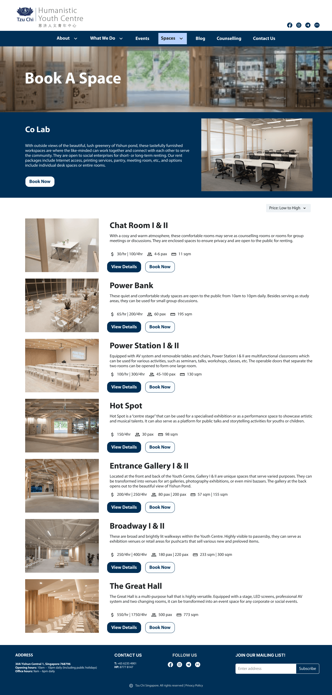
Book A Space Page
Old Design
Tzu Chi HYC has areas around its centre where users can book. Students can book a small space to study or an organization can book a function room for an event. Currently each space does not have sufficient information and users wil have to select “view detail” which will open a pdf that show more details.
New Design
By having important details such as size and price, users can have a smoother process for booking. Also by adding a “Book Now” button, this process is further expedited.
Our Partners Page
Our Partners Page
Old Design
Certain area of are occupied by partners of HYC. They are mostly cafes and fitness organizations. In this page, there is no contact details and opening hours. The “more” button only opens up to a summary of what each partners are. There is also no photo of each partner’s area.
Old Design
Certain area of are occupied by partners of HYC. They are mostly cafes and fitness organizations. In this page, there is no contact details and opening hours. The “more” button only opens up to a summary of what each partners are. There is also no photo of each partner’s area.

New Design
Contact details, opening hours and social media have been added as well as a summary of each partner so users can call individual partners for more information. A carousel style image for each partner to showcase their area and business.
New Design
Contact details, opening hours and social media have been added as well as a summary of each partner so users can call individual partners for more information. A carousel style image for each partner to showcase their area and business.

Final Thoughts
Though this project was mostly a UI upgrade for our clients website, I learned that in sometimes in UX, you have to considered both parties problems in order to find a middle ground that satisfy both client and users.
Our client was pleased with our design and have then redesign and redeveloped their website.
Here is their current website: https://hyc.tzuchi.org.sg/
Book A Space Page
Old Design
Tzu Chi HYC has areas around its centre where users can book. Students can book a small space to study or an organization can book a function room for an event. Currently each space does not have sufficient information and users wil have to select “view detail” which will open a pdf that show more details.
New Design
By having important details such as size and price, users can have a smoother process for booking. Also by adding a “Book Now” button, this process is further expedited.